art prints

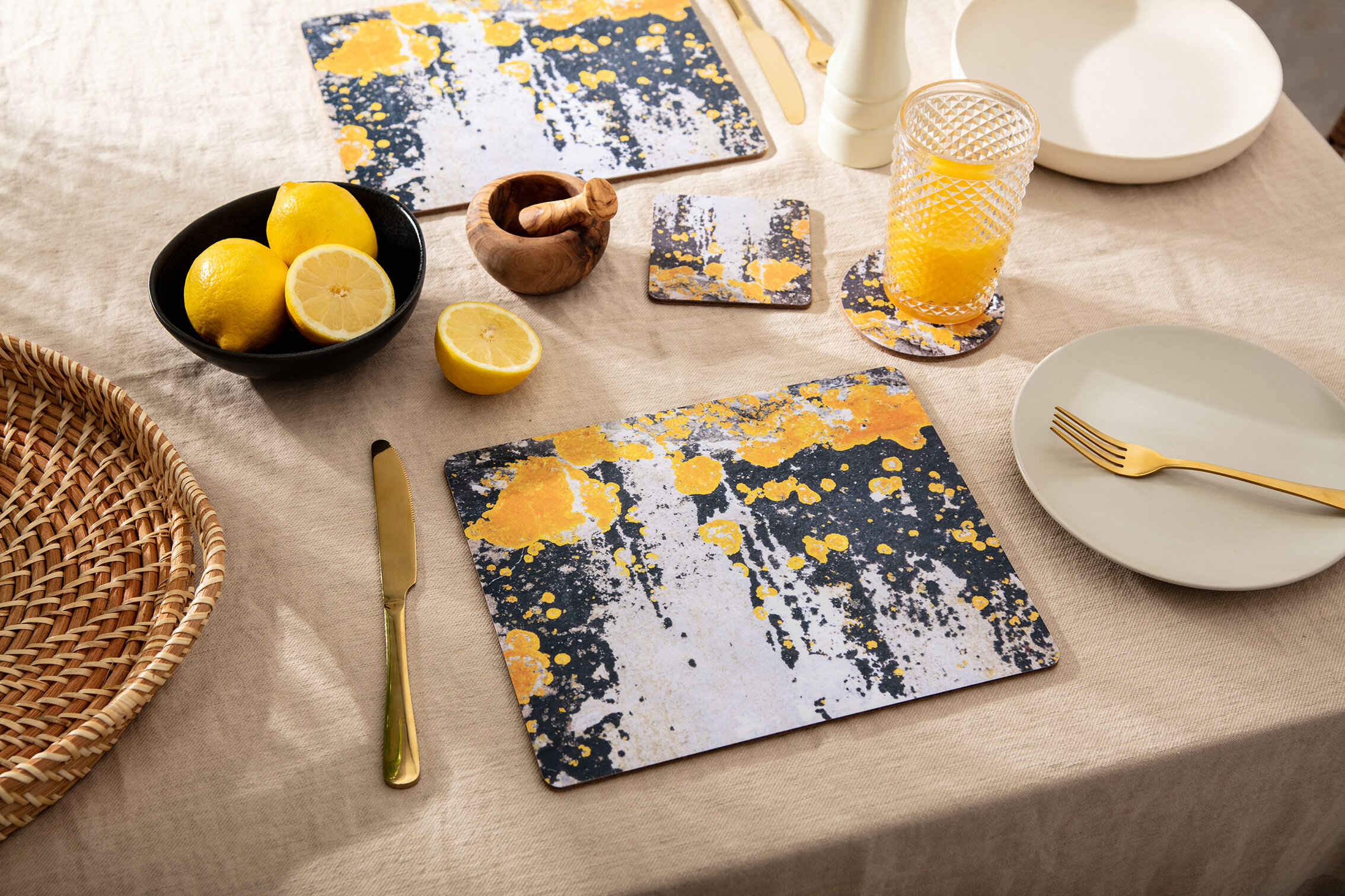
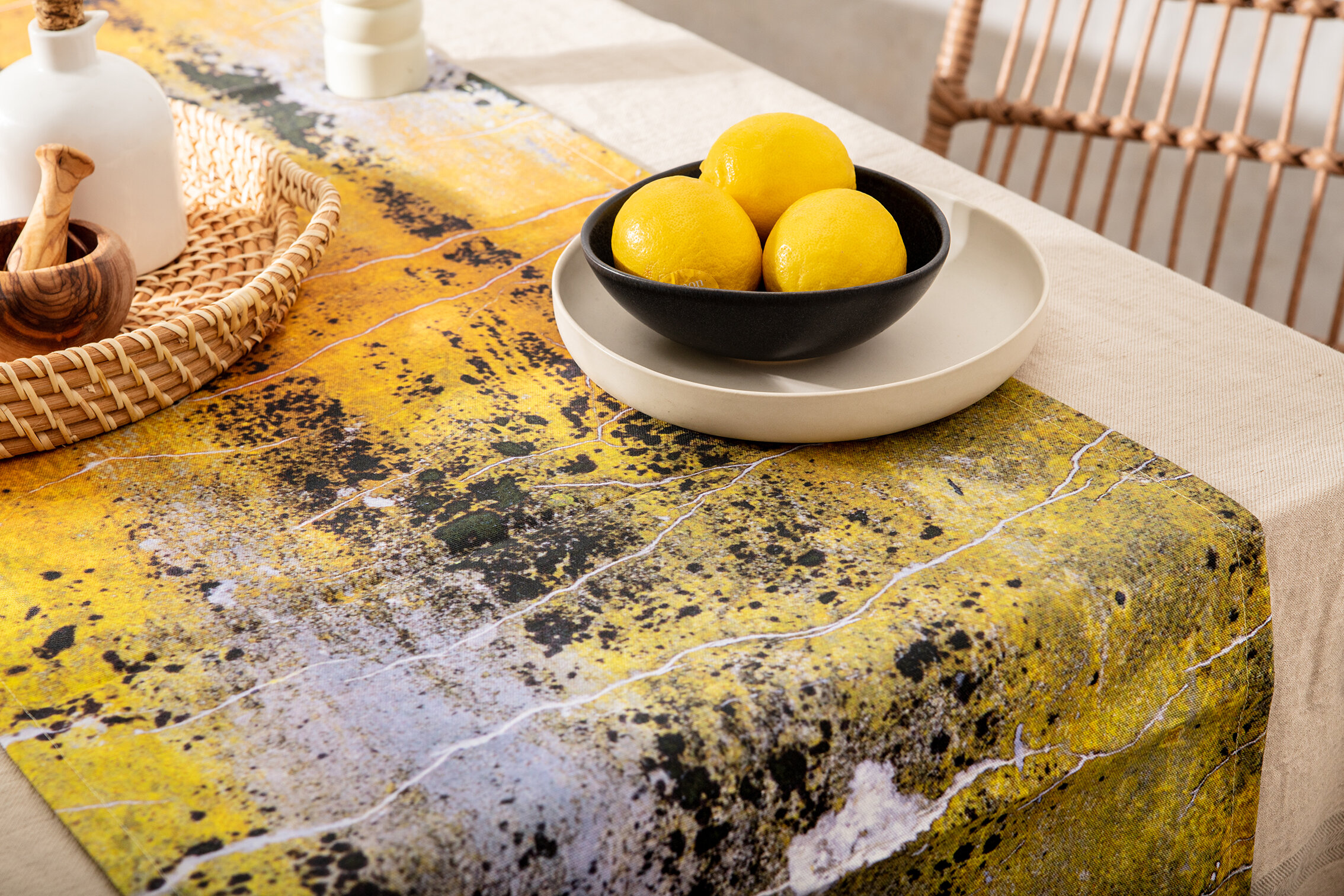
Add tones of Yellow to your interior decor, to create a happy home.

Looking forward to a brighter future… after Living Coral in 2019 and Classic Blue in 2020, PANTONE® introduces Ultimate Gray + Illuminating Yellow into the mix for 2021, perfect to create a happy home!

2021 PANTONE® Colour of the Year is described as ‘A marriage of colour conveying a message of strength and hopefulness that is both enduring and uplifting’.

Soft Grey and Yellow Ochre abstract wall art print - 'Nomad Splash Eclipse' - from £25

Soft Grey and Yellow Ochre abstract wall art print - 'Nomad Splash Eclipse' - from £25

Practical and rock solid but at the same time warming and optimistic, the union of PANTONE 17-5104 Ultimate Gray + PANTONE 13-0647 Illuminating is one of strength and positivity. It is a story of colour that encapsulates deeper feelings of thoughtfulness with the promise of something sunny and friendly.

These tones can be found in our very own Nomad collection, active designs evoking travel nostalgia, holiday happiness and inspiring creativity.

SHOP NOMAD HERE

NOMAD - celebrating 5 years of trading with the launch of a new collection

Introducing Nomad, active designs evoking travel nostalgia, holiday happiness and inspiring creativity. Nomad is Ruth Holly’s 3rd collection to date, a celebratory NEW collection - marking 5 years of trading. Nomad is inspired by change, the changes the business has gone through in 5 years and how that has changed Ruth as a designer and the changes nature goes through during each season.

ART_SCAPE

Here is no.1 of a monthly feature called Art_scape. An arty escape for 5 mins to soak creativity up into your eye balls.

I regularly use Pinterest as a source of inspiration and collection, those of you aware of it will know of it's absorbing power. Those not, here is it's strap line - "Pinterest helps you discover and do what you love. Find recipes, style inspiration, projects for your home and other ideas to try. " 

It also allows creatives access to unlimited visual feasting, hours of procrastination and heart wrenching urges to get paints out and just play. 

This month my focus will be to introduce more colour into my life. Over the last few years I have been drawn to muted tones and this has had a strong impact on my designs. They are subtle, understated and beautiful and don't ask for attention.

(Don't tell everyone), but of late I'm enjoying a quiet revival, I have been looking at gathering colour and how to use it, here's what I found;

ARTSCAPE_001.jpg

Hayward Gallery Shop open!

So as I'm sure you're all aware by now, we have recently collaborated with the Hayward Gallery, on a range of home ware and stationery products. The gallery contacted us back in September 2017 and commissioned a bespoke collection, exclusive to the Southbank Centre, a world-famous, multi-venue arts centre based in Central London. 

Chosen for my design ethos; "designing thoughtful, tactile products that inspire the viewer to look longer and deeper at raw beauty", I was thrilled to be given the opportunity to portray this Brutalist style gallery in a beautiful and commercial way.

Dynamic-605a737f-6fb9-564b-b7dd-d51cac7f834c.jpg

The controversial 1960/70’s  'Brutalist' architectural style, is so often dismissed without consideration of its true merits. It’s so fulfilling to showcase these for what they really are. The collection is urban and raw, but with a soft feel, it was a really fun challenge.

The range includes;

a choice of 6 art cards

6 notebook designs (sold in sets of 3)

6 digital A2 prints

cotton tea towels in 2 designs

placemats in 2 designs

cushions in 2 sizes/designs

To purchase any of these beautiful products, please visit Southbank Centre’s online shop, or visit their museum stores.


RUTHHOLLYXHAYWARD_ARTPRINTPYRAMIDS.jpg