warehouse home

DERELICT DREAMS

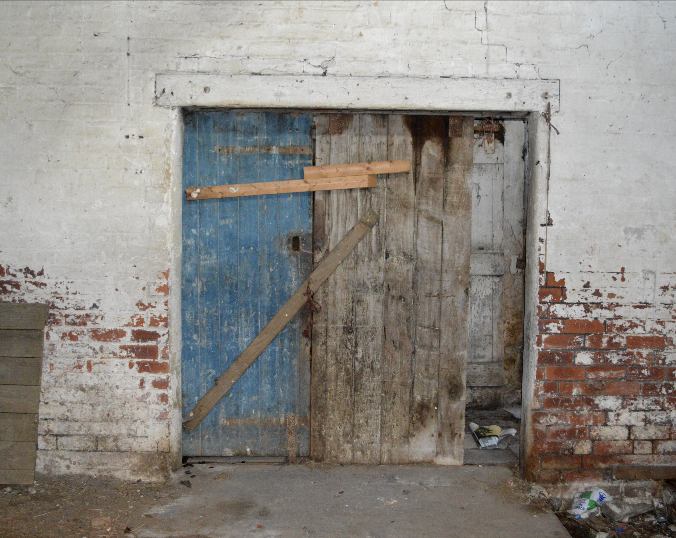
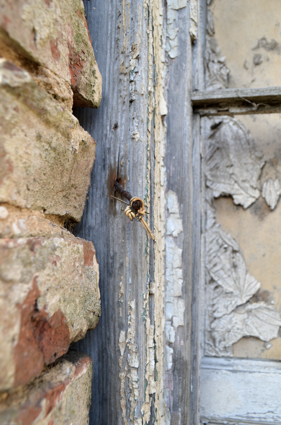
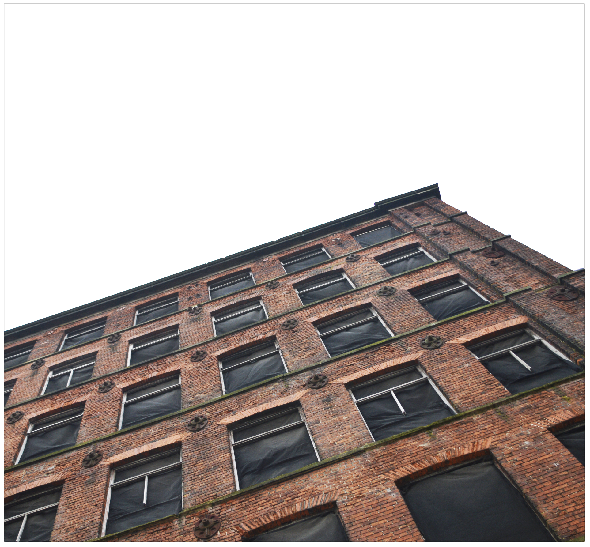
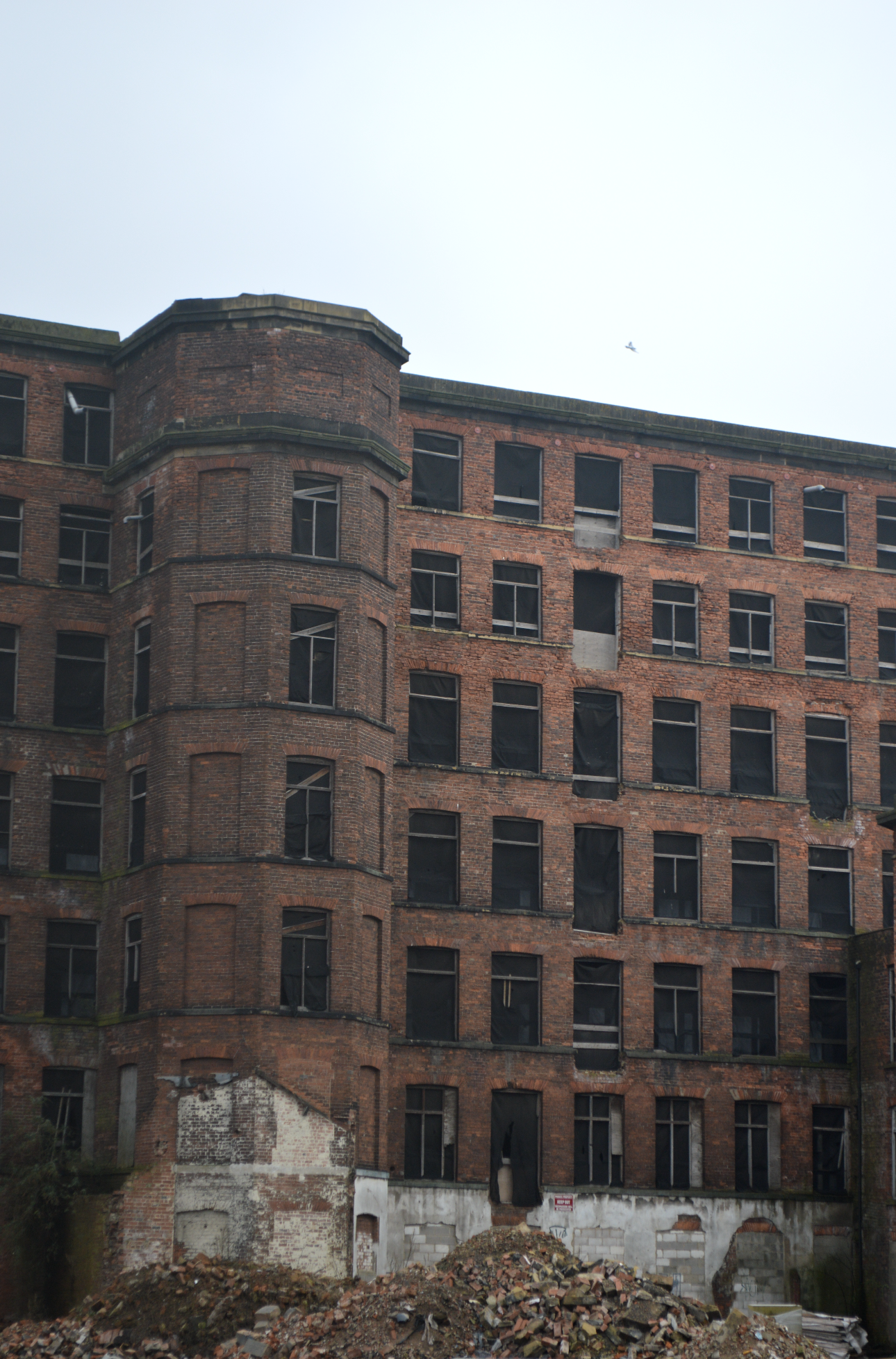
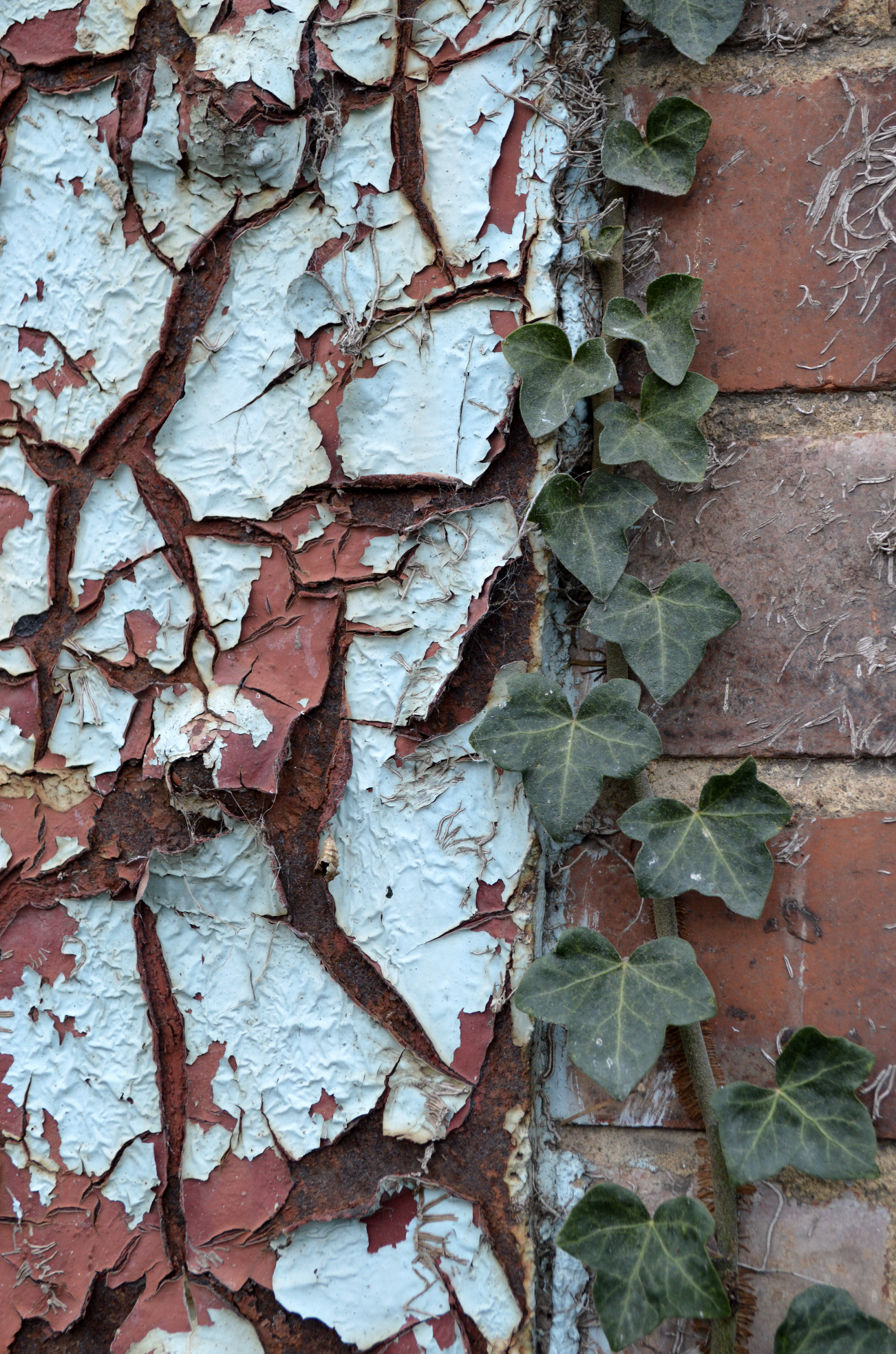
A while ago now my partner and I set off on a derelict adventure.

Running your own business means there is often only the smallest of opportunity for creativity, as a lot of the time is hustle and admin. But one clear Sunday we packed our bags, flask, camera, hats, snacks! and set off to North Yorkshire.

I had already planned the places I wanted to visit courtesy of Google, and Richard methodically plotted each destination for maximum coverage and speed.

There were some false starts ( the website I had used was quite old so some of the ‘derelict’ buildings had new shiny built on top), there was lots of driving and much screeching to a halt if either of us spotted a gem that wasn’t on ‘the route’.

All in, it was a beautiful fun day, and I got some really fab shots I’m happy with, and will use in the future.

Here’s a peek!
ART_SCAPEtwo

Ready to escape visually into a world of art and design for 5 mins?

Today I'm looking at the work of several artists using a limited colour palette with refreshingly raw, muted tones. Focusing on form and shape, these artists don’t need to use bright colours to attract their audience, the draw is created from texture, simplicity, shape and style.

Miyuki Shiro’s work reminded me of the recent Giuseppe Penone exhibition I visited at the Yorkshire Sculpture Park recently, though his main exhibition was sculpted trees and large scale wood cuttings, he had a few pencil line drawings that would bend the eye and made the viewer really focus on what he/she was looking at. Emil Berild’s ceramics are full of depth and desire, the charcoal burnt textures and tones make his smoke fired pieces dramatic and dangerous. My own work, ‘Wholesome’ - from the Signature collection, features deep and intense colour combos, broken only slightly by a flicker of light.

This is what I love about art; it isn’t obvious, it isn’t something you easily consume, it makes you think, it challenges and inspires, it grabs and grows you and is never EVER dull.

ARTSCAPE_002-01.jpg

FEATURED IN

Delighted to be featured once again in the latest issue of Warehouse Home. Ruth Holly's large birchwood textures tray was used as part of their 'PEELING GOOD' trend feature.

Warehouse home is a bi-annual design magazine, providing essential interior design inspiration for loft apartments and warehouse conversions as well as decorating ideas for incorporating vintage, industrial and reclaimed furniture in a modern home.

Can you spot it here on Page 14? 

WAREHOUSE8.jpg